MOBILE APP PROPOSAL


King County Library System

CREATIVE BRIEF


MOBILE APP PROPOSAL: KING COUNTY LIBRARY SYSTEM

CLIENT
King County Public Library
King County Public Library System is the public library system for the King County area. They have been serving the residents of King County, Washington since 1942. Their headquarter is located in Issaquah, Washington; and they are currently the busiest library system in the United State. The King County Library System is consists of 48 libraries, circulating 22.4 millions items, a traveling library center, a mobile TechLab, and the ABC Express children’s library van.
THE PROBLEM
King County Library System has a beautifully built website with tons of contents and features. Sadly, the same couldn’t be said for their mobile approach. Their mobile version website is at most usable with a simple layout design. On the other hand, their mobile app is very dull, unappealing, out-dated design, buggy, and features lacking. Since about 60% of the world Internet traffics come from mobile devices, being one of the busiest library system in the united state, we feel that it is very important for them to have a much better mobile presence than what they currently have.
SOLUTION PROPOSAL
After analyzing their website and comparing it to their app, we spotted many inconsistencies happening with their content as well as their logo. Their website also has a much more modern feel compared to their mobile app. We are planning to improve their brand consistency as well as aesthetics by redesigning King County’s Library System’s mobile application. The Application would be readily accessible for free on the Apple Store as well as Google Play.
TARGET AUDIENCE
Students
Teachers & professors
Family friendly
COLLATERAL
Android based mobile application

CASE STUDY


TEAM - NOT ( JESSICA SANTOSA  |  TRU DINH  |  YOUNGIL LEE )

BEHIND THE NAME
The story behind the team name “not” was that we are not just only a team, but more than that. Partner, classmate, and friends.


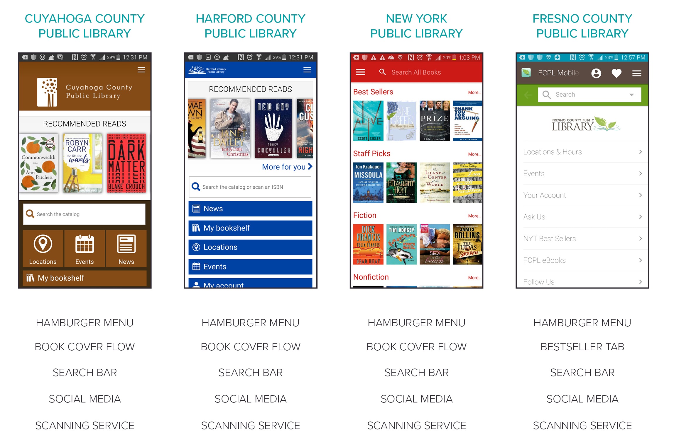
COMPETITIVE ANALYSIS

Through the analysis, we have seen some standard features and interactions that most library mobile apps should have. Most of library mobile app include book cover flows of recommended book and bestseller on the first page. They have hamburger menu containing “Catalog”, “My Account”, “Location”, and “Search” menu. They also put a search bar on the first page to minimize the user effort to search a search function. All competitors support the scanning service for ISBN, book bar-code, and library card bar-code by phone’s camera.

USER NEEDS
ADOPTING
UNNECESSARY


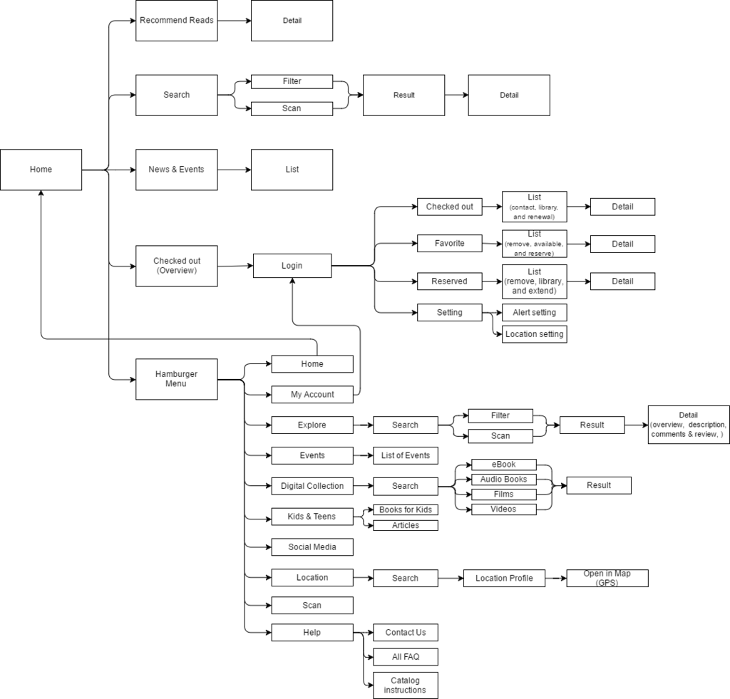
FLOW CHART


PERSONA


USER SCENARIO


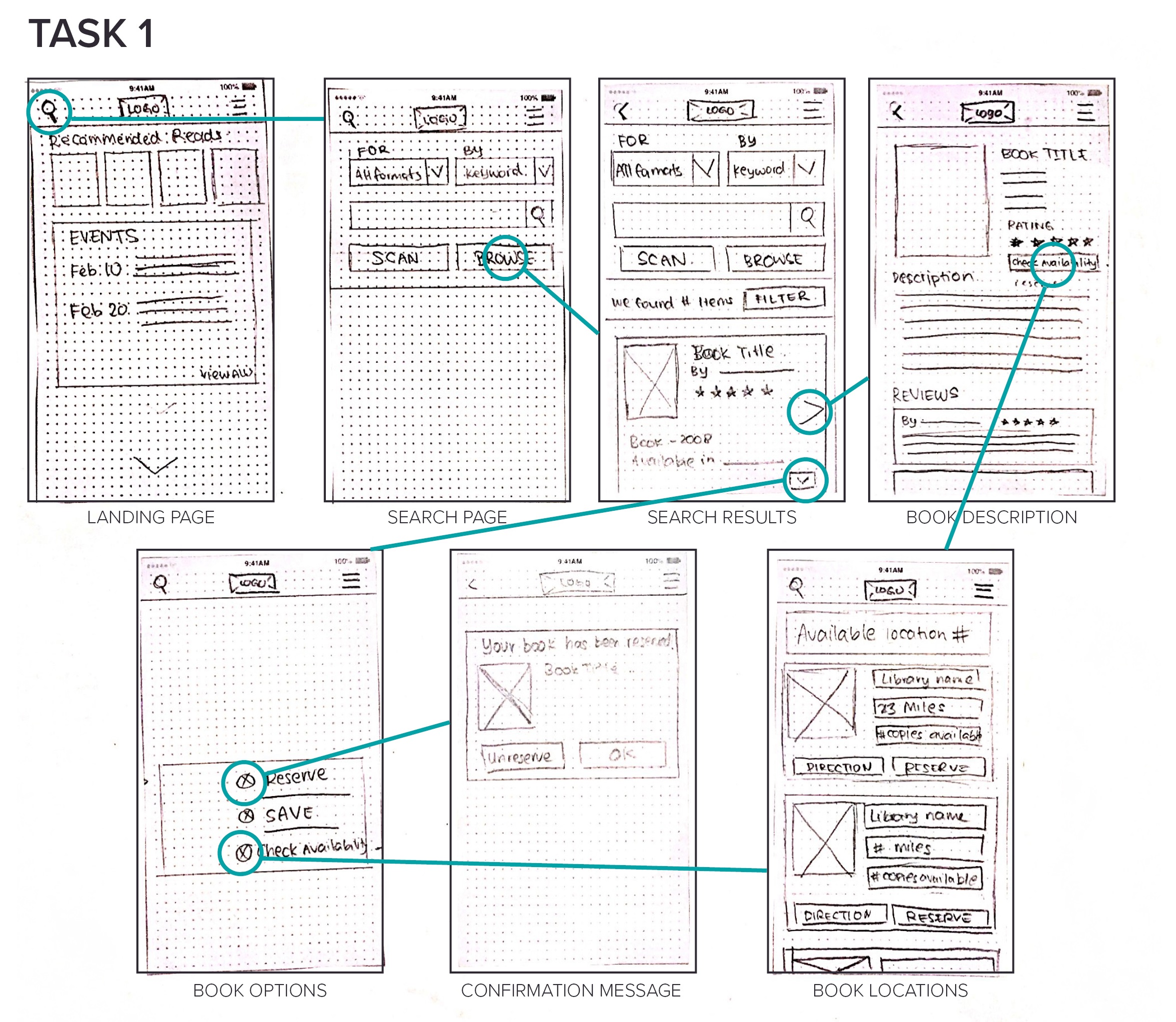
PAPER PROTOTYPE


COMMENTS, PROBLEMS, AND CONFUSIONS


WIRE-FRAME PROTOTYPE

PROTOTYPE


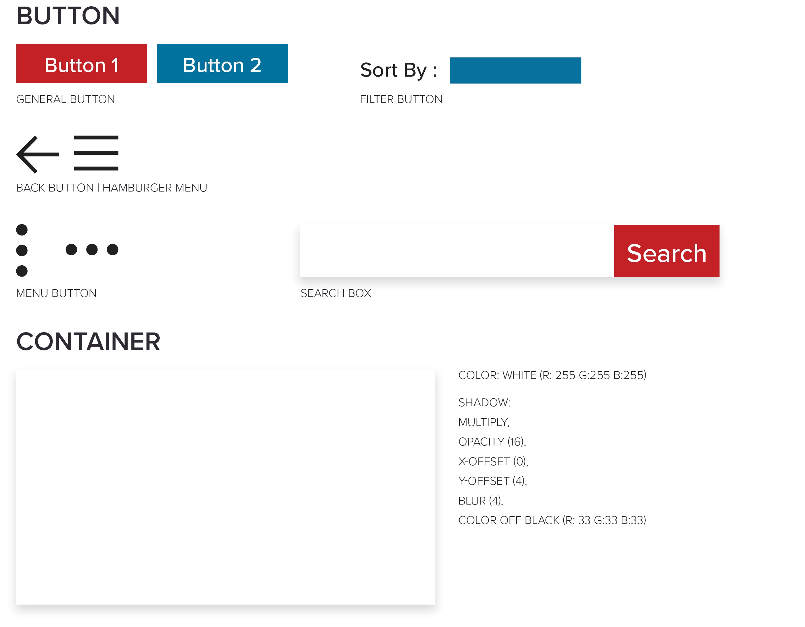
STYLE GUIDE


USABILITY TESTING

STUDY GOALS
PARTICIPANT SCREENING CRITERIA
TASKS


TEST RESULT

User 1

(observation) Couldn’t find the map button on task 1
(comment) Soo many click
(suggestion) Alert feature
(comment) Don’t separate events from kids
(comment) Make it simple, less tap
(suggestion) Combine Events and kids & Teen events

User 2

(comment) Library location look like a book profile
(suggestion) Move “location” to top 3 on the menu underneath “explore”
(suggestion) Universal search box, search location
(comment) Events text look too small, didn’t know it was click-able

User 3

(comment) Make sense overall
(comment) Strange to have two separate event page
(suggestion) Ability to favorite an event
(comment) Overall nice

User 4

(comment) Text too small on checked-out page
(suggestion) Change green to orange for checked-out page, green feel too safe.
(observation) Last task seems confusing to tester
(comment) Two event page is confusing, text too small
(comment) Button too small
(comment) Overall look clean and well organized
(comment) No kids event indication at event page.

User 5

(comment) Like the small (1) for notification
(comment) Seem clear and look clean
(comment) Green is too neon bright
(comment) Look simple, everything is easy and fast
(suggestion) Hamburger menu tab, overlay
(comment) Text too small
(suggestion) Symbol for overdue book

User 6

(observation) She thought the search box on the home page could locate library
(comment) Seems straight forward
(comment) Second task is very clear since its on the homepage

COMMON PROBLEMS, COMMENTS, AND SUGGESTIONS

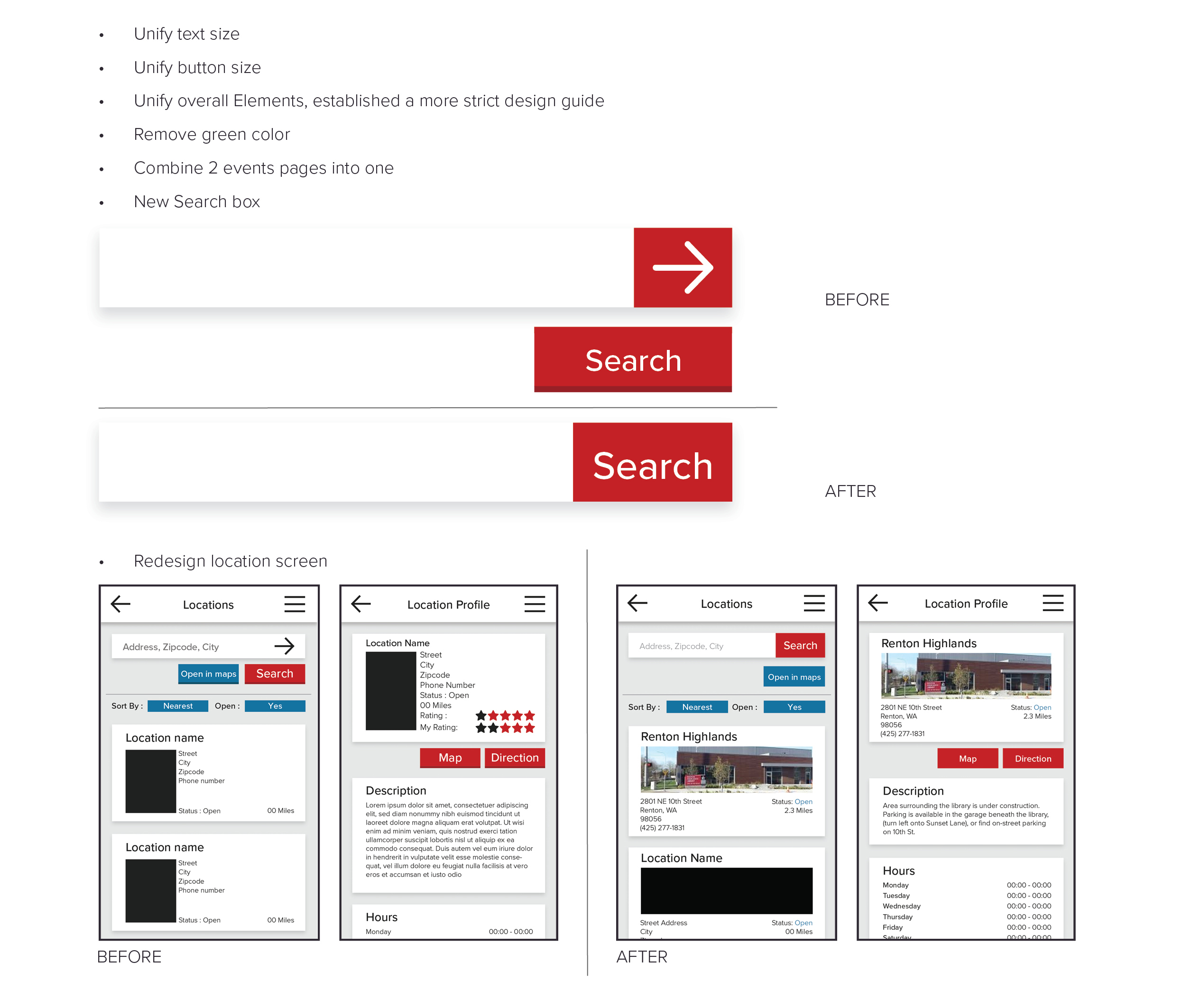
Separate events pages for kids/teen and main events confuses user
Text are too small on certain pages, inconsistency
Green color is too neon bright
Button are too small on certain page
Universal search box



CHANGES


HI-FI PROTOTYPE

PROTOTYPE

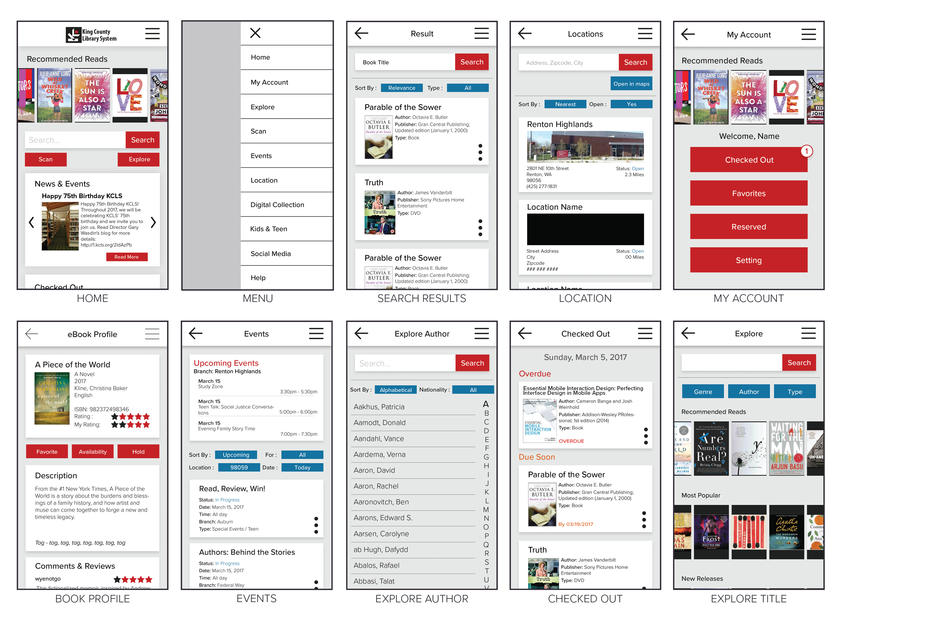
To see the full case study, download the pdf file.


DOWNLOAD

FINAL


PROTOTYPE